Easy. Looks cleaner and more organised too
It may look better but the UX is pretty bad. For example changing your mobile phone plan: if you're not very careful you will end up with a new sim. Existing customers who change their plan have a sim automatically added to their 'cart' and have to remove that line item further in the process.
Now this is bad enough, but if there was a bold link saying 'existing customers click here' that explained the shortcomings of the system that would mitigate the impact of the workaround. Theres a link all right, hidden away....
Sorry but when you're in the industry yourself usability errors like this really grate. No communication to your user base, no clean migration path, poor security practices, I'd just really expect more from a well capitalised company like Telecom.


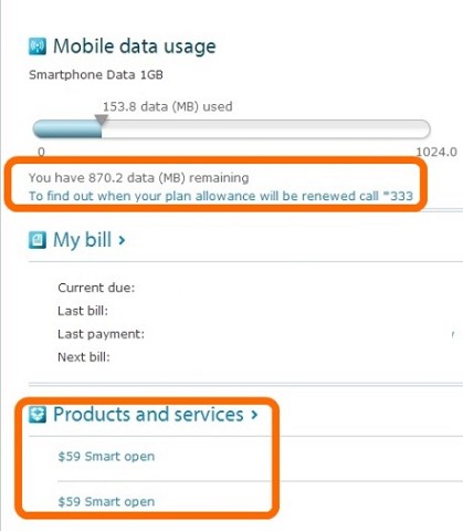
 ) if that is the plan you are on. Otherwise you get charged overage based on your plan.