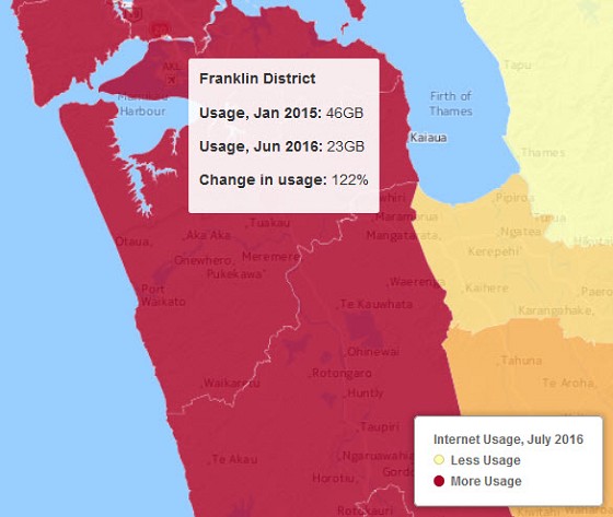
Internet map shows big variations in broadband consumption
At last - something useful from Stuff. 
Two navigable and zoomable maps:
Internet usage, July 2016
Change in connection speed
These are national maps of internet consumption compiled by Chorus.
The maps show Chorus' copper and ultrafast broadband (UFB) networks but DO NOT measure the data consumption of people on networks that aren't owned by Chorus.
These include Vodafone's cable networks in Wellington and Christchurch and the UFB networks in Christchurch, Whangarei and the central North Island, including Hamilton.