So many websites are trying to do pop up log ins, sub screens and a myriad of other fancy but useless things now that they are becoming unusable. Trying to log in while sub menus disappear as soon as you move a mouse, ajax calls not completing, captcha and other drop downs that have no info in them as the latency or servers are so bad, little snippets blocking the button you need to click ( e.g. get help screens side sliders) . The list goes on - and this type of experience is getting worse all the time.
I am presenting Gem visa as my first nomination in the worst log in / site UI experiences hall of shame. Any others?
GEM VISA.
Start here and try to log in as a gem visa user: https://www.gemfinance.co.nz/contact-us/Having the worst log in experience Ive seen in a while ( three log in screens to get to the point where you put in user name and password) - which then does a pop up that disappears when you try to put the mouser over it ...
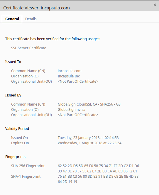
They then present a certificate that is so last year -- errrrrr so year before last year. Scarily bad for a finance company.