Geekzone: technology news, blogs, forums
Guest
Welcome Guest.
You haven't logged in yet. If you don't have an account you can register now.


mdf

mdf

3566 posts

Uber Geek
+1 received by user: 1519

Trusted

#201609 26-Aug-2016 12:48
Send private message

My google-fu has failed me.


I am trying to turn this:


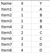
Into something that looks a bit like this:


i.e. an item is assigned to "matrix" box and displayed visually depending on it's categorisation in two separate categories (which are in this case literally 1 through 4 and A through D, though in practice there will be a lot more than 8 items to be matrixized.


Google has been my friend many times in the past for Excel queries, but in this case I'm not even sure the name or description of what I'm looking for. I can't imagine I will get what I want out of a simple function/chart, fully expecting to have to VB this.


Create new topic
BlueShift
1692 posts

Uber Geek
+1 received by user: 969


  #1617842 26-Aug-2016 13:04
Send private message

Looks a bit like a Pivot table. I'd start there.


KrazyKid
1247 posts

Uber Geek
+1 received by user: 616


  #1617852 26-Aug-2016 13:22
Send private message

Also looks like a could be a scatter plot with the points being unique date if you ignore the colors.


Maybe try xyz scatterplot or 3d Scatter plot?


Good luck


MikeAqua
8024 posts

Uber Geek
+1 received by user: 3817


  #1617873 26-Aug-2016 13:53
Send private message

Would an area plot work for you?


Mike


mdf

mdf

3566 posts

Uber Geek
+1 received by user: 1519

Trusted

  #1618014 26-Aug-2016 18:07
Send private message

Thanks everyone. All the suggestions got close but not quite what I was looking for.


In the end sorted it out by setting up the matrix chart how I wanted it, then using this script to create a ConcatenateIfs function. I then used this function to "pull" in the data that matched the X/Y criteria, so got all the items listed nicely in the relevant cells.


TwoSeven
1712 posts

Uber Geek
+1 received by user: 304

Subscriber

  #1618029 26-Aug-2016 18:40
Send private message

You could probably do it in power query (get and transform) in excel. You write a m script to select your source data and for each row, stick a category on it, the take the result and create your output data table formatted the way you want.


Software Engineer
   (the practice of real science, engineering and management)
A.I.  (Automation rebranded)
Gender Neutral
   (a person who believes in equality and who does not believe in/use stereotypes. Examples such as gender, binary, nonbinary, male/female etc.)


 ...they/their/them...


Create new topic


Geekzone Live »

Try automatic live updates from Geekzone directly in your browser, without refreshing the page, with Geekzone Live now.


Are you subscribed to our RSS feed? You can download the latest headlines and summaries from our stories directly to your computer or smartphone by using a feed reader.