

Fred99:
Sam91:
Fred99:
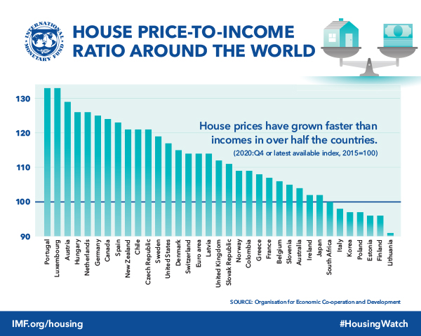
From OECD. NZ is leading the world at something, apparently:
I'm far from an expert, but isn't that graph is misleading? Shouldn't it start at zero?
No. The dotted line in the middle at 100 is baseline based on 2010 data, so NZ has become about 30% less affordable (based on household income to house price ratio), Spain about 25% more affordable.
Then the graph is in fact misleading.
a) It's not a graph of "House Price to Income Ratio", but a graph of the Change in House Price to Income Ratio since 2010. It may be that, although Spain's houses are still relatively more expensive than NZ's, they were even more expensive in 2010.
b) The bars below 100 (Portugal - Spain) should descend from the 100 line, not ascend from the X axis.


