

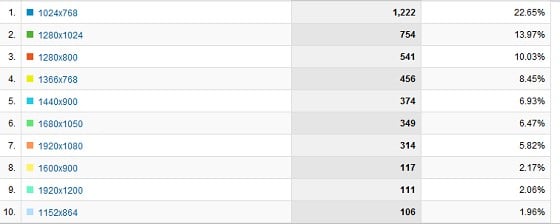
This has probably been talked about, but i wanted to have a moan. With the exception of a few websites (including this one) Most websites are not in widescreen format, eg Trademe, Stuff, and IGN. and that is to name but a few. Most if not All laptops, pc monitors and even tv's that surf the web are 16:9 or a similar widescreen format. So WHY are all these websites still in a 4:3 format. It is terrible to look at when using a 1080p laptop monitor, and half of the screen is either blank or advertising.
When will these popular sites get with the times and offer 16:9 support like geekzone does?


 Trusted


 Administrator
 ID Verified
 Geekzone
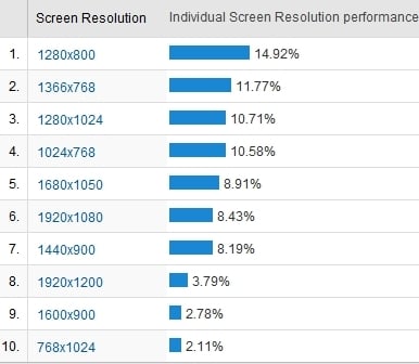


