I think this wins certainly is amongst the 'best' (worst) design in this whole thread.
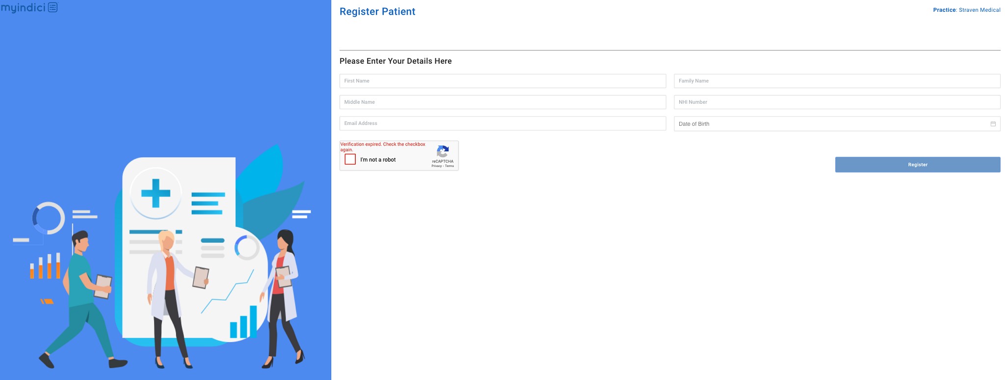
New depths of web design sadism - Forcing users to navigate through this bloody awful gui to enter a birth date! There is no freeform input allowed!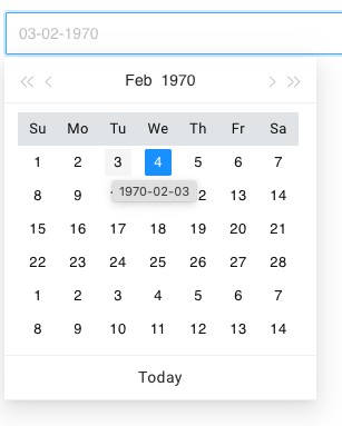
Took me a minute or two, but I believe if you absolutely know what you're doing - This is the fastest way to enter your birthday:
You have to click field.
Click year.
Click back.
Click year range.
Click back.
Click your birthday decade range.
Click your year.
Click your month.
Click your date.
9 clicks. For something you absolutely should be able to just tap into your number pad!!
And this is a freaking medical patients portal. It took me a minute to work it out, they expect geriatric patients to figure this out?
Wow.
Myindici.co.nz web developers, I do not know you from Adam, but I really do not like your work ethic if this was somehow allowed into a PROD design for catering to the absolutely widest range of potential customers. I need to book an appointment to see my doctors. Your customers are nearly certainly sick or hurt as well! Further diminishing their capability to jump through hoops!
Just wow.
Edit: it gets better! When you click 'Register' you're presented with a pop-up saying 'You're registered, you can only book visits for now, show your ID to be able to see more'
And then takes you back to the cleared registered form! If you weren't paying attention or are easily confused (again... patients for a Doctors here) you could easily register again!
And the icing on the cake..
YOU CANNOT ACTUALLY ENTER THE SITE!! NOTHING HERE ALLOWS YOU TO LOG IN!!??
And no prompt/notes to advise you: 'you will get an email with more instructions' or anything helpful!
I have never come across such a piss poor registration page. Seriously. The devs should be ashamed of themselves! If you're on here - Please please make this make sense??