Geekzone: technology news, blogs, forums
Guest
Welcome Guest.
You haven't logged in yet. If you don't have an account you can register now.


Filter this topic showing only the reply marked as answer View this topic in a long page with up to 500 replies per page Create new topic
1 | 2 | 3 | 4 | 5 | 6 | 7 | 8 | 9 | ... | 21
frankv
5680 posts

Uber Geek

Lifetime subscriber

  #2455462 6-Apr-2020 08:22
Send private message


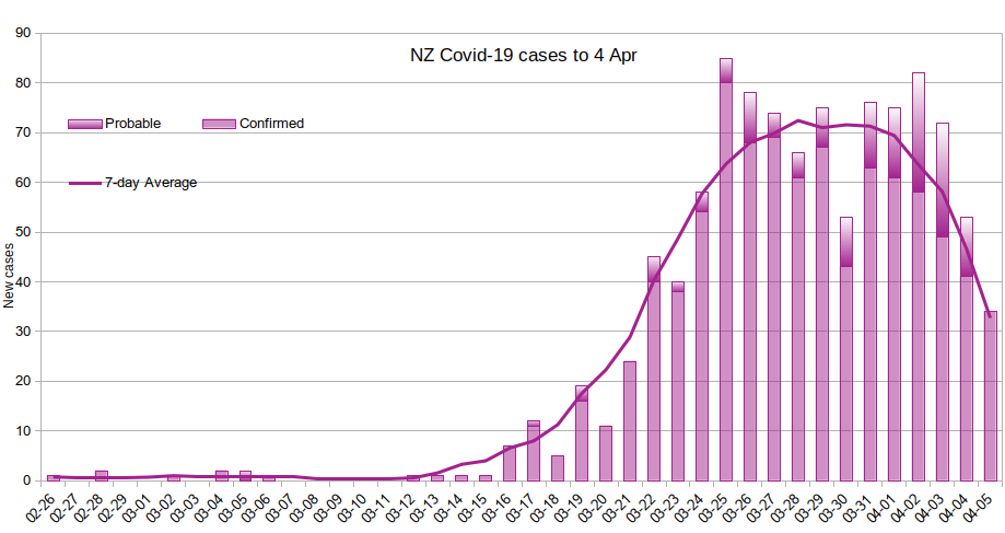
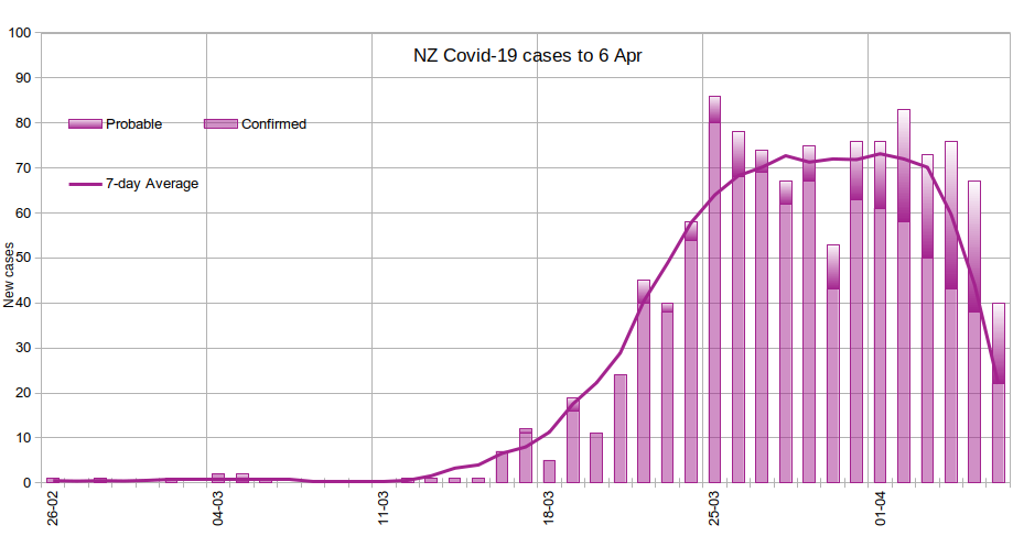
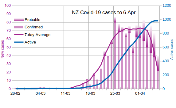
The apparent levelling out at the end of the average graph is just an artifact; the moving average is calculated as the average of {preceding 3 days, current date, next 3 days}. For the last three days in the graph, there are less and less "next" values to include in the moving average, so the average depends more on preceding values. e.g. for the last day, there are no "next" values at all, so the average calculated is of the last 4 days. And, because the numbers are falling, that will be higher than the actual number.


frankv
5680 posts

Uber Geek

Lifetime subscriber

  #2455869 6-Apr-2020 15:02
Send private message


I've cleaned up the "leveling out" artifact by assuming a constant linear trend; the moving average will now always end exactly on the last day's total.


[Edit]: Oops... the graph title is wrong. This graph is up to 5 Apr, not 4 Apr.


gnfb
2609 posts

Uber Geek

ID Verified

  #2455979 6-Apr-2020 16:05
Send private message

This looks like a smart idea from the desk of Jack Dorsey


https://play.google.com/store/apps/details?id=org.howwefeel


an app to say how you feel and identify the area i guess


I bet one of "the clever ones" could knock this up in a afternoon, you know for the sake of mankind or kiwikind?


Is an English Man living in New Zealand. Not a writer, an Observer he says. Graham is a seasoned 'traveler" with his sometimes arrogant, but honest opinion on life. He loves the Internet!.


I have two shops online allshop.nz    patchpinflag.nz
Email Me


neb

neb
11294 posts

Uber Geek

Trusted
Lifetime subscriber

  #2456081 6-Apr-2020 17:17
Send private message

gnfb:

This looks like a smart idea from the desk of Jack Dorsey


https://play.google.com/store/apps/details?id=org.howwefeel


an app to say how you feel and identify the area i guess


There's 17 megabytes of program there to (ostensibly) indicate that you feel OK or not. I'd wait a bit to see if there's an indication of what the other 16.9 megabytes of code is doing on your phone.

neb

neb
11294 posts

Uber Geek

Trusted
Lifetime subscriber

  #2456152 6-Apr-2020 19:04
Send private message

Latest deaths-per-capita graph from the friend of mine who's tracking this:


Numbers are slowly trending downwards...

neb

neb
11294 posts

Uber Geek

Trusted
Lifetime subscriber

  #2456185 6-Apr-2020 21:09
Send private message

Another pandemic graph forwarded from the aforementioned friend:


You can see the double-humps from London and presumably NY coming out of lockdown too early.

frankv
5680 posts

Uber Geek

Lifetime subscriber

  #2456485 7-Apr-2020 14:39
Send private message


Minor tweak to the design, showing vertical grid lines for the weeks.


Cloud spending continues to surge globally, but most organisations haven’t made the changes necessary to maximise the value and cost-efficiency benefits of their cloud investments. Download the whitepaper From Overspend to Advantage now.
concordnz
472 posts

Ultimate Geek

Trusted
EMT (R)

  #2456529 7-Apr-2020 16:07
Send private message

@frankv 
Whats the chances of 'overlaying' (so it doesnt mess up the structure of your current graph)
A daily 'cases recovered' - say in a Blue bar" for each day?


frankv
5680 posts

Uber Geek

Lifetime subscriber

  #2456546 7-Apr-2020 16:23
Send private message

All of my data comes from 2 columns in the MoH daily spreadsheet. Unfortunately, they don't provide data on which cases have recovered.

What I've done is to keep a cumulative total of all cases. Then, to get the active cases, for each day I subtract the number that there was 14 days earlier, on the assumption that (practically) everyone has recovered 2 weeks after contracting the disease. Not surprisingly, this graph is quite similar to the 7-day average, just a bit smoother, 14 days to the right, and the numbers are 14 times as big. Hence, the "active cases" is on a different scale to the "new cases". From this, looks like we haven't actually got to peak infection yet, but I expect (hope) that within the next week that line should start to drop. This doesn't account for people in hospital or ICU who (I assume -- I am not a virologist) are still infected several weeks later.


DS248

1691 posts

Uber Geek

Lifetime subscriber

  #2456584 7-Apr-2020 17:24
Send private message

How well does NZ compare with other southern hemisphere countries?


Update of plot comparing southern hemisphere countries.  Added South Africa (SA) but their data look a bit odd (new cases dropped sharply immediately following lockdown)?  Will probably not retain.


Taiwan added for contrast (probably the most successful mid-size+ high income country in terms of controlling the virus) 


AR, SA & NZ are 'full' lockdowns


AU1 : Borders close (20/3) 
AU2 : Places of social gathering closed - cafes & restaurants takeaway only (23/3)
         Now treating this as the main (partial) lockdown.  29/3 appears to have been more clarification.
AU3 : Clarified lockdown except for work and education + public gatherings now limited to two people (29/3)                


CL1 : Borders close (16/3)
CL2 : Nighttime curfew (~22/3) 
CL3 : Regional lockdowns start (26/3)   


In the above semi-log plot of total cases, NZ has generally tracked Argentina, though in recent days appears to be doing slightly better.  The drop in NZ new cases in the last two days does not clearly stand out yet.  Both countries implemented similar 'full' lockdowns.  Argentina imposed lockdown a few days before NZ and had fewer cases than NZ had at time of lockdown.


Chile has generally tracked Australia (though rate of growth not dropping off as fast).  In both countries the lockdowns are 'partial' (relative to NZ).  Both had more total cases than NZ at the time their 'lockdowns' were imposed


At face value, the plot suggests Argentina and especially NZ are performing significantly better than Australia and Chile.


However, plotting in terms of cases 1 million population tells a different story, as per the plot below (in this case showing new cases per day).  The arrows show the main lockdowns imposed (in this case showing AU2 for Australia - see above). In the legend, the numbers in brackets are the total tests per 1m population, and CFR-7.  With only one death so far the CFR-7 value for NZ is fairly meaningless.  For NZ, the daily totals are the new cases advised by MOH each day, not per the 'notified date' in the individual case data, which is presumably the date when tested positive?


Observations:


  • Per capita case numbers for Argentina are much lower than  those in the other three countries.  However, their much less extensive testing and higher CFR suggests the number of cases there may be significantly under-counted,  The CFR for Argentina is still considerably lower than the corresponding figure for UK (CFR-7 = 27.5%) though.
  • Per capita cases at time of lockdown imposition in NZ, Chile & Australia were similar and remained similar for several day afterwards
  • Though CFR-7 for Chile (1.3%) is higher than for Australia (0.9%), it is less than the value for South Korea (1.9%) and only half the value for Germany (2.5%).  It therefore does not necessarily indicate under counting.  
  • On a per capita basis Australia would appear to outperforming NZ despite our view of their 'lockdown' (schools and work excluded).  Their daily new cases dropped within 5 - 6 days of 'lockdown', possibly reflecting the higher proportion of imported cases in Australia.  New cases there now only about a third of NZ new cases per capita.
  • NZ new cases may at last be falling - and should be by now?  However, the drop over the last two days is barely any more than the drop between 28 - 31 Mar so it will need a few more days before we can be confident that it is real (though hopefully it is).
  • The large sustained decrease in new cases in Australia over the last 10 days looks more convincing.  And is backed by a high level of testing over there.  
  • Cases per capita (and even date) do not really support the claim that 'NZ went early' on lockdown.


nzkc
1571 posts

Uber Geek


  #2456754 7-Apr-2020 22:55
Send private message

frankv:


Minor tweak to the design, showing vertical grid lines for the weeks.


Your stats for today seem to be about 10 less than the official figures.  e.g.: today's confirmed cases was 32 where as your graphs seems to show 22.


Or am I reading it wrong?


DS248

1691 posts

Uber Geek

Lifetime subscriber

  #2456762 8-Apr-2020 00:20
Send private message

nzkc: 
frankv: ... (plot of NZ cases)


Your stats for today seem to be about 10 less than the official figures.  e.g.: today's confirmed cases was 32 where as your graphs seems to show 22.


Or am I reading it wrong? 


See my earlier post re this issue (#2454515).  The 22 shown in frankv's plot are cases 'notified' on 6 Apr (when the tested person was notified?).  The increase announced in today's (7 Apr) briefing includes cases notified on previous days as well as the 22 'notified' on 6 April.


Having had a son tested on Saturday morning, I now realise there is more of a lag in the NZ data than I appreciated.  He was told he would get his result in 5 - 8 days!  Given he has not been advised yet, the earliest it will be is 4 days (if he was to be notified tomorrow).  A rather significant issue given that his partner is an essential service medical worker and cannot work until he is cleared.


Does that mean the 'notified' dates may be up to 8 days after testing was performed.  And a further lag of up to 2-3 days between a person being notified and when it is included in the new cases announced in the MOH daily briefings.  If so, we have a significant backlog of cases.  It may therefore take longer than I anticipated for the full impact of the lockdown to show up?  The case data would be much more useful if it included date of testing. 


frankv
5680 posts

Uber Geek

Lifetime subscriber

  #2456835 8-Apr-2020 08:42
Send private message

nzkc:


Your stats for today seem to be about 10 less than the official figures.  e.g.: today's confirmed cases was 32 where as your graphs seems to show 22.


Or am I reading it wrong?


Every day, there's a discrepancy between what the MoH announce in terms of new confirmed cases, and the number in their spreadsheet of confirmed cases for the preceding day. My graphs are taken from the spreadsheet.


Perhaps some of the new confirmed cases being announced yesterday were probables who had subsequently been confirmed, so their date in the spreadsheet doesn't change, but they are included in the new confirmed cases count announced by the MoH. Possibly there's a lag in reporting to the MoH (although I can't imagine why), so that some of the new confirmed cases being announced were actually reported in preceding days.


frankv
5680 posts

Uber Geek

Lifetime subscriber

  #2456838 8-Apr-2020 08:44
Send private message

DS248:


The case data would be much more useful if it included date of testing. 


And date of recovery.


Yogi02
238 posts

Master Geek


  #2456901 8-Apr-2020 09:22
Send private message

Nice work on the stats frankv and DS248!


1 | 2 | 3 | 4 | 5 | 6 | 7 | 8 | 9 | ... | 21
Filter this topic showing only the reply marked as answer View this topic in a long page with up to 500 replies per page Create new topic


News and reviews »

Air New Zealand Starts AI adoption with OpenAI
Posted 24-Jul-2025 16:00


eero Pro 7 Review
Posted 23-Jul-2025 12:07


BeeStation Plus Review
Posted 21-Jul-2025 14:21


eero Unveils New Wi-Fi 7 Products in New Zealand
Posted 21-Jul-2025 00:01


WiZ Introduces HDMI Sync Box and other Light Devices
Posted 20-Jul-2025 17:32


RedShield Enhances DDoS and Bot Attack Protection
Posted 20-Jul-2025 17:26


Seagate Ships 30TB Drives
Posted 17-Jul-2025 11:24


Oclean AirPump A10 Water Flosser Review
Posted 13-Jul-2025 11:05


Samsung Galaxy Z Fold7: Raising the Bar for Smartphones
Posted 10-Jul-2025 02:01


Samsung Galaxy Z Flip7 Brings New Edge-To-Edge FlexWindow
Posted 10-Jul-2025 02:01


Epson Launches New AM-C550Z WorkForce Enterprise printer
Posted 9-Jul-2025 18:22


Samsung Releases Smart Monitor M9
Posted 9-Jul-2025 17:46


Nearly Half of Older Kiwis Still Write their Passwords on Paper
Posted 9-Jul-2025 08:42


D-Link 4G+ Cat6 Wi-Fi 6 DWR-933M Mobile Hotspot Review
Posted 1-Jul-2025 11:34


Oppo A5 Series Launches With New Levels of Durability
Posted 30-Jun-2025 10:15


Geekzone Live »

Try automatic live updates from Geekzone directly in your browser, without refreshing the page, with Geekzone Live now.


Are you subscribed to our RSS feed? You can download the latest headlines and summaries from our stories directly to your computer or smartphone by using a feed reader.